Snapchat’s ghost logo is one of the most recognizable symbols in the tech world. The bright yellow background and playful ghost icon make it stand out from other social media apps. While many tech brands use blue and white, Snapchat chose yellow to be different. This bold choice reflects the app’s fun and unique personality.
The ghost logo represents Snapchat’s main feature: disappearing messages. These are photos and videos that vanish after being viewed, just like a ghost. This clever design connects directly to the app’s purpose and makes it memorable.
In this article, we’ll explore the meaning behind the Snapchat ghost logo. You’ll learn about its history, how it evolved from the old Snapchat logo, and why it’s so iconic today. We’ll also discuss the ghost’s name, the design choices that make it stand out, and what 👻 means in Snapchat. Plus, we’ll touch on the latest Snapchat+ features and answer common questions about the yellow ghost logo and the company’s branding.
By the end, you’ll have a clear understanding of the Snapchat logo’s journey and its role in making the app a global success.
The History of the Snapchat Ghost Logo
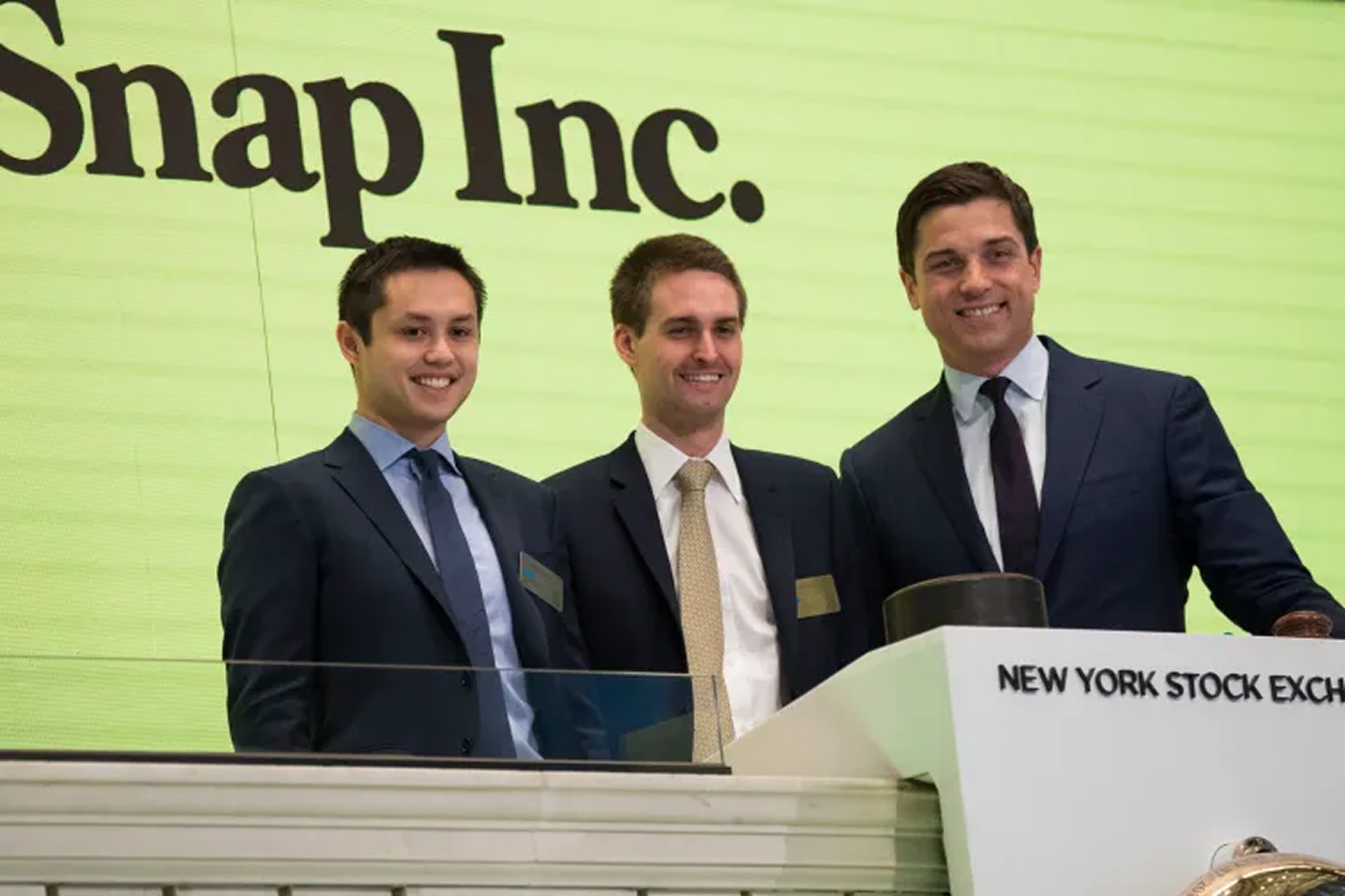
Snapchat launched on July 8, 2011, but it wasn’t always called Snapchat. The app’s original name was Picaboo. It was created by three university students: Reggie Brown, Evan Spiegel, and Bobby Murphy. Their idea was simple—an app where photos would disappear after being viewed.
From the beginning, the app stood out with its bright yellow logo and ghost symbol. This design was different from other tech brands, which often used blue and white. The unique look helped Snapchat gain attention in a crowded market.
Reggie Brown came up with the original idea for the app. However, he needed help with the business side. He brought in Evan Spiegel to handle that part. Bobby Murphy joined the team to build the app, as he was skilled in coding. Together, they created the first version of Picaboo.
After the app launched, things took a dramatic turn. Reggie Brown was removed from the company, leading to a legal dispute. He sued Evan Spiegel and Bobby Murphy, claiming he was unfairly pushed out. The lawsuit ended with a $157.5 million settlement for Reggie Brown. This dispute became a key part of the Snapchat founding story.
Evan Spiegel designed the ghost logo himself. He created it one evening on his computer and named it “Ghostface Chillah.” The name was inspired by rapper Ghostface Killah, showing Spiegel’s love for rap music. The ghost logo became a symbol of Snapchat’s playful and disappearing messages.
Despite the early conflicts, Snapchat grew into a massive success. The story of its creation, including the Picaboo vs. Snapchat transition and the lawsuit, is as fascinating as the app itself. The ghost logo, with its unique name and design, remains an iconic part of Snapchat’s identity.
The Meaning Behind the Snapchat Ghost Logo
The Snapchat ghost logo is more than just a fun design. It represents the app’s core promise: privacy and temporary communication. The ghost symbolizes the fleeting nature of Snapchat messages. Photos and videos disappear after being viewed, just like a ghost vanishes. This makes the logo a perfect metaphor for the app’s focus on impermanence.
Snapchat’s branding is built around this idea of unseen communication. The ghost logo visually communicates the app’s promise of safe, private sharing. It reassures users that their moments are temporary and won’t stay online forever. This meaningful design connects directly to the app’s purpose, making it both functional and symbolic.
The choice of a ghost wasn’t random. It reflects the psychology of ephemeral design. By using a friendly ghost, Snapchat makes disappearing messages feel approachable and fun. This contrasts with other social media platforms like Instagram, which focus on permanent content. Snapchat’s logo design highlights its unique brand values and sets it apart in the world of ephemeral messaging apps.
The ghost, often called “Ghostface Chilian,” is a great example of narrative design in tech. It translates a product feature—disappearing messages—into a visual identity. This case study of the Snapchat logo shows how a simple symbol can communicate a brand promise effectively. It’s a functional logo that tells a story, blending symbolism with practicality. Snapchat’s success proves how powerful a meaningful logo can be.
The Evolution of the Snapchat Ghost Logo
2011: The Picaboo Logo
Snapchat’s story began in 2011 when it was called Picaboo. The original logo, known as Ghostface Chilian, featured a playful ghost with a round head, small arms, and a wavy bottom edge. The ghost stuck its tongue out, giving it a fun and quirky vibe. Evan Spiegel, one of Snapchat’s founders, chose yellow for the logo because no other major app used it. This bold color made the Picaboo logo stand out in a crowded market. The Picaboo app original logo screenshot shows how the design reflected the app’s playful nature.
2013: The Faceless Ghost
In 2013, Snapchat rebranded and updated its logo. The ghost, Ghostface Chilian, lost its facial features. This change coincided with the launch of Snapchat Stories, a feature that allowed users to share snaps visible for 24 hours. The company explained that removing the face symbolized the wide range of emotions users could express on the app. This faceless logo branding strategy made the ghost more universal and relatable. However, some speculate the change was also tied to a Snapchat logo copyright lawsuit. The Snapchat Stories feature launch date marked a turning point in the app’s growth and branding.
2019: The Bold Border
In 2019, Snapchat updated its logo again. This time, the ghost’s black border became thicker and darker. The goal was to improve accessibility in logo design by making the icon easier to see from a distance. However, the change sparked a Snapchat logo update 2019 backlash. Users noticed the new design in the iPhone App Store and reacted strongly. Many left negative reviews and even started a petition to change Snapchat logo back. Despite the controversy, Snap Inc. explained that the thicker border was meant to enhance visibility. That same year, Snapchat introduced AR Lenses 2019 launch, allowing users to add fun filters to their snaps. This innovation helped shift attention away from the Snapchat thick border logo controversy.
Design Elements of the Bright Yellow Ghost Logo
The Snapchat logo is simple yet powerful. It features a white ghost outlined in black, placed on a bright yellow background. The yellow shade is Pantone Yellow U, with the hex code #FFFC00. These design elements make the logo easy to recognize and memorable.
Snapchat’s choice of yellow is unique in the tech world. Most tech companies use blue in their branding. By using yellow, Snapchat stands out. The color represents energy, positivity, and clarity, aligning with the app’s youthful and fun personality. The black outline around the ghost improves logo accessibility, ensuring it’s visible on any screen. This combination of yellow and black also meets WCAG contrast ratio standards, making it easier to see.
The ghost icon itself is central to the design. It symbolizes Snapchat’s main feature: disappearing photos and videos. Like a ghost, the content is there one moment and gone the next. This visual metaphor explains the app’s purpose without words. The rounded corners of the app icon add a friendly and approachable feel, which appeals to younger audiences.
The Evolution of the Snapchat Logo
The Snapchat logo has evolved over time. It started with a more detailed design and gradually became simpler. The original logo, created during the Picaboo era, featured a ghost with a red tongue. The name Picaboo is a play on words, as it sounds like “a photo of a ghost” in Spanish. This playful connection inspired the ghost icon.
In earlier versions, the yellow background had a gradient. Over time, it was replaced with a solid yellow to create a cleaner look. The ghost’s red tongue was also removed to simplify the design. This trend of logo simplification is common in tech, as it improves recognition and usability.
The Color Palette and Its Meaning
Snapchat’s brand colors are yellow, black, and white. Each color has a purpose. Yellow represents energy, fun, and clarity. White symbolizes purity and new beginnings. Black adds contrast and makes the design accessible. Together, these colors create a youthful and vibrant brand identity.
The choice of Pantone Yellow U (Hex #FFFC00) was strategic. Snapchat wanted a color that no major competitor used. This bold decision helped the app stand out in a crowded market. The solid yellow background, combined with the black-outlined ghost, ensures the logo is both visually striking and functional.
Snapchat logo color codes
| Yellow | Hex Color: #FFFC00RGB: 255 252 0CMYK: 0 1 100 0Pantone: PMS 396 C |
| Black | Hex Color: #000000RGB: 0 0 0CMYK: 0 0 0 100Pantone: PMS Process Black C |
Snapchat Plus: A New Subscription Service
Snapchat launched Snapchat+ in July 2022. This subscription service was introduced to help the company earn more money as it faced falling ad revenue. The move marked a shift toward a subscription revenue model, similar to other social media premium tiers like Twitter Blue and Telegram Premium. The launch has been successful, showing strong interest in paid features.
Snapchat+ costs $3.99 per month or $29.99 per year. Currently, it is only available in select countries. However, Snap Inc. has announced plans for global expansion, aiming to make Snapchat+ available to more users worldwide. If you’re wondering, “When will Snapchat+ be available in [Country Name]?” the company is working on it.
So, what makes Snapchat+ worth it? Here are some of the most popular features:
- Pin #1 Best Friend: Keep your top friend pinned at the top of your chat list for easy access.
- Story Rewatch Indicator: See which friends have rewatched your stories.
- Custom App Icons: Change the Snapchat app icon on your phone with exclusive designs.
- Solar System: A fun feature that shows your closest friends as planets in a “solar system.”
- Priority Story Replies: Your replies to creators and public figures are more visible to them.
- Post View Emoji: Choose an emoji that appears after friends view your snaps.
- Custom Story Expiration: Set your stories to expire after one hour or up to one week.
- One Free Monthly Snapstreak Restore: Restore a lost Snapstreak for free once a month.
- Custom Chat Colors: Personalize your chat windows with different colors.
- Story Boost: Increase the visibility of your stories to reach more people.
Snapchat+ has already contributed to boosting revenue for Snap Inc. The company’s Q2 2022 earnings report highlighted the need for new income streams, and this subscription service has helped fill that gap. By offering exclusive features like the Solar System and Story Boost, Snapchat+ provides value that the free version doesn’t.
As of 2023 and 2024, Snapchat+ subscriber growth continues to rise. User feedback has been mostly positive, with many praising features like Pin Best Friend and Story Rewatch Indicator. However, some reviews question whether Snapchat+ is worth it for casual users. The service is ideal for those who want more personalization and visibility on the platform.
Snapchat+ is a key part of Snap Inc.’s strategy to diversify its revenue and compete with other social media platforms offering premium tiers. With plans for global expansion and growing interest in its exclusive features, Snapchat+ is set to play a big role in the company’s future.
The Future of Snapchat
As many social platforms work hard to maintain user activity during economic slowdowns, Snapchat continues to stand out with steady and impressive growth. Since 2020, the platform has consistently increased its number of daily active users (DAUs), showing stronger user engagement than major competitors like Meta and Twitter.
One of Snapchat’s biggest strengths is its ability to adapt quickly—especially in areas like augmented reality, creator tools, and interactive content. These innovations have helped the platform stay relevant, particularly among younger audiences who value fast, visual, and authentic communication.
According to Snap Inc., Snapchat reached 332 million DAUs in Q1 2022, reflecting a remarkable 18% increase from the previous year. This upward trend highlights not only the platform’s resilience but also its potential for future expansion as it continues to innovate and refine the user experience.
FAQs on the Snapchat Ghost Logo
What tech company is known for its bright yellow ghost logo?
Snapchat is the famous tech company with a ghost logo. It is recognized worldwide for its disappearing messages and unique branding.
Why is Snapchat’s logo a ghost?
The ghost symbolizes Snapchat’s main feature: temporary messaging. Photos and videos sent on the app disappear after being viewed, much like a ghost vanishing.
What was the original Snapchat logo?
The first Snapchat logo, created in 2011 during the Picaboo era, featured a friendly ghost with its tongue sticking out. This design was more detailed compared to the current clean and simple version.
Why did Snapchat remove the tongue from the logo?
Snapchat simplified its logo to make it more modern and versatile. Removing the tongue helped create a cleaner design that better fits the app’s evolving brand identity.
What are Snapchat’s post format specifications?
Snapchat posts use a full-screen format of 1080 x 1920 pixels with a 9:16 aspect ratio. Videos can be between 3 and 180 seconds long. If a video is shorter than 3 seconds, it loops to meet the minimum length.
Which font does Snapchat use?
Snapchat uses the Avenir Next font for its text. This modern sans-serif font matches the app’s fun and youthful style.
How is Snapchat coded?
Snapchat’s tech stack includes several technologies. The front end uses Bootstrap and JavaScript. The backend is built with Python. For iOS, the app is coded in Objective-C and Cocoa Touch.
Is the Snapchat logo a ghost or a bell?
The Snapchat logo is a ghost. It represents the app’s disappearing messages, aligning with its brand promise of temporary communication.
What are the colors of the Snapchat logo?
The Snapchat logo features bright yellow, black, and white. The yellow background, officially Pantone Yellow U (Hex #FFFC00), is a key part of its branding. It helps the app stand out from competitors.
Is Snapchat the only tech company with a ghost logo?
Snapchat is the most famous tech company with a ghost logo. While other companies, like Phantom crypto wallet, also use ghost imagery, Snapchat’s design is iconic and strongly tied to its brand identity.
Final Thoughts on the Snapchat Logo
The evolution of the Snapchat ghost logo reflects the brand’s growth and maturity. It started as a playful, detailed design and transformed into the simple, modern icon we recognize today. This transition mirrors Snapchat’s journey from a small startup to a global tech leader. The logo’s simplicity, relevance, and memorability have helped it remain iconic while aligning with the app’s core purpose.
Snapchat continues to grow as a platform. In Q4 2023, Snap Inc. reported a 15% revenue increase, reaching $1.373 billion. The number of Daily Active Users (DAU) also rose by 9%, totaling 443 million globally. These figures, highlighted in the Snap Inc. Q4 2023 earnings report, show the app’s ongoing popularity and success.
The story of the Snapchat logo offers valuable lessons for brands. A strong logo should be simple, meaningful, and easy to remember. It must connect with the brand’s identity and purpose. For Snapchat, the ghost perfectly symbolizes its disappearing messages feature. This alignment between design and function has made the logo a key part of its brand identity.
If you’re creating a logo for your own brand, focus on simplicity and relevance. Memorable logo design elements can significantly impact how people perceive your company. Whether you’re a startup or an established business, refining your brand identity through effective logo design is essential. For expert support in creating a logo that stands out, our team is here to help.
